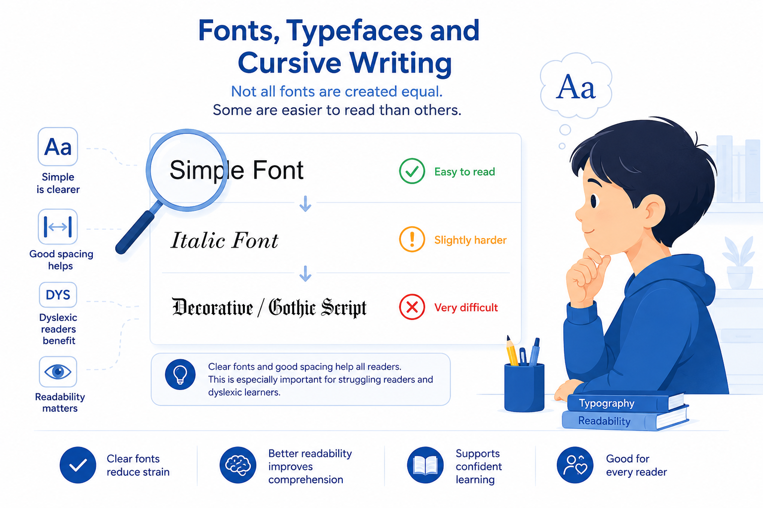
I'm dyslexic, which among other things, causes difficulty in reading various fonts or cursive writing. For example, fonts like this one, or THIS GOTHIC SCRIPT, or cursive handwriting where the letters are joined (especially if the writer writes carelessly). Italic writing is also hard for me to decipher. Difficulty with these is not unique to me, as research shows that many people with dyslexia or learning disabilities face similar challenges, to varying degrees. So, the easiest way for us to read is a simple and printed font, like what you are reading.
There is a school of thought that suggests that designing ‘dyslexic-specific’ fonts will solve the problem. Their reasoning is that the eyes of a dyslexic person will identify the letters better. I’m not sure if I agree with this premise – perhaps they may help some. My reasoning is that dyslexia is not a visual issue; it’s related to the brain. We can close our eyes (removing the visual aspect) and still transpose numbers or letters while saying them aloud. Research also shows that many students with learning disabilities, including dyslexia, have poor word memory. The visual component of a specifically designed font is unlikely to be a game-changer for dyslexics.
That said, I am open to developments; however, more research is needed before these new forms become truly meaningful. For now, I suggest using a simple font with reasonable spaces between letters, making them easier to distinguish. It’s also important to avoid excessive spacing, as dyslexics may struggle to connect letter combinations if the letters are too far apart. For instance, hyphenated words at the end of a line can be particularly challenging.
Grey letters, and some other colours, can be difficult to read, especially for those with Irlen Syndrome (a type of visual or perceptual processing disorder). For more information, visit Irlen Syndrome.
It is generally agreed that black text on a white background is the easiest to read. From this website, you can also see that both Irlen Syndrome and Dyslexia are not purely visual issues, but rather related to brain function.
Written by Pat Grayson.